Beautiful gradients, button styles and TextField rounded corners in a new Flet release

We've just released Flet 0.1.46 adding new exciting features:
- Gradient backgrounds in Container
- Extensive styling for buttons, TextField and Dropdown controls
- ...and more
Gradient backgrounds
Linear gradient
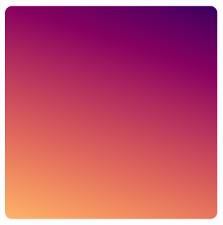
import math
import flet as ft

def main(page: ft.Page):

    page.add(
        ft.Container(
            alignment=ft.alignment.center,
            gradient=ft.LinearGradient(
                begin=ft.alignment.top_left,
                end=Alignment(0.8, 1),
                colors=[
                    "0xff1f005c",
                    "0xff5b0060",
                    "0xff870160",
                    "0xffac255e",
                    "0xffca485c",
                    "0xffe16b5c",
                    "0xfff39060",
                    "0xffffb56b",
                ],
                tile_mode=ft.GradientTileMode.MIRROR,
                rotation=math.pi / 3,
            ),
            width=150,
            height=150,
            border_radius=5,
        )
    )

ft.run(main)
Check LinearGradient docs for more information about LinearGradient properties.
Radial gradient
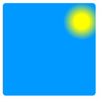
import flet as ft

def main(page: ft.Page):

    page.add(
        ft.Container(
            alignment=ft.alignment.center,
            gradient=ft.RadialGradient(
                center=Alignment(0.7, -0.6),
                radius=0.2,
                colors=[
                    "0xFFFFFF00",  # yellow sun
                    "0xFF0099FF",  # blue sky
                ],
                stops=[0.4, 1.0],
            ),
            width=150,
            height=150,
            border_radius=5,
        )
    )

ft.run(main)
Check RadialGradient docs for more information about RadialGradient properties.
Sweep gradient
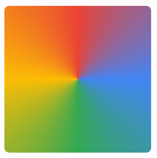
import math
import flet as ft

def main(page: ft.Page):

    page.add(
        ft.Container(
            alignment=ft.alignment.center,
            gradient=SweepGradient(
                center=ft.alignment.center,
                start_angle=0.0,
                end_angle=math.pi * 2,
                colors=[
                    "0xFF4285F4",
                    "0xFF34A853",
                    "0xFFFBBC05",
                    "0xFFEA4335",
                    "0xFF4285F4",
                ],
                stops=[0.0, 0.25, 0.5, 0.75, 1.0],
            ),
            width=150,
            height=150,
            border_radius=5,
        )
    )

ft.run(main)
Check SweepGradient docs for more information about SweepGradient properties.
Buttons styling
This Flet release introduces style property to all button controls which is an instance of ButtonStyle class.
ButtonStyle allows controlling all visual aspects of a button, such as shape, foreground, background and shadow colors, content padding, border width and radius!
Moreover, each individual style attribute could be configured for a different "Material states" of a button, such as "hovered", "focused", "disabled" and others. For example, you can configure a different shape, background color for a hovered state and configure fallback values for all other states.
Check this "extreme" styling example:
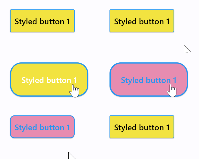
import flet as ft
from flet.border import BorderSide
from flet.buttons import RoundedRectangleBorder

def main(page: ft.Page):

    page.add(
        ft.ElevatedButton(
            "Styled button 1",
            style=ft.ButtonStyle(
                color={
                    ft.MaterialState.HOVERED: ft.Colors.WHITE,
                    ft.MaterialState.FOCUSED: ft.Colors.BLUE,
                    ft.MaterialState.DEFAULT: ft.Colors.BLACK,
                },
                bgcolor={ft.MaterialState.FOCUSED: ft.Colors.PINK_200, "": ft.Colors.YELLOW},
                padding={ft.MaterialState.HOVERED: 20},
                overlay_color=ft.Colors.TRANSPARENT,
                elevation={"pressed": 0, "": 1},
                animation_duration=500,
                side={
                    ft.MaterialState.DEFAULT: BorderSide(1, ft.Colors.BLUE),
                    ft.MaterialState.HOVERED: BorderSide(2, ft.Colors.BLUE),
                },
                shape={
                    ft.MaterialState.HOVERED: RoundedRectangleBorder(radius=20),
                    ft.MaterialState.DEFAULT: RoundedRectangleBorder(radius=2),
                },
            ),
        )
    )

ft.run(main)
ft.MaterialState.DEFAULT state is a fallback style.
Button shape could also be changed with ButtonStyle.shape property:
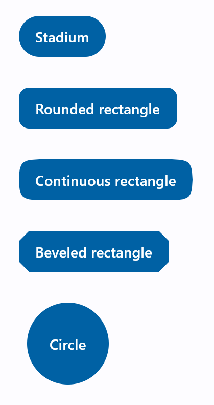
import flet as ft
from flet.buttons import (
    BeveledRectangleBorder,
    CircleBorder,
    ContinuousRectangleBorder,
    RoundedRectangleBorder,
    StadiumBorder,
)

def main(page: ft.Page):
    page.padding = 30
    page.spacing = 30
    page.add(
        ft.FilledButton(
            "Stadium",
            style=ft.ButtonStyle(
                shape=ft.StadiumBorder(),
            ),
        ),
        ft.FilledButton(
            "Rounded rectangle",
            style=ft.ButtonStyle(
                shape=ft.RoundedRectangleBorder(radius=10),
            ),
        ),
        ft.FilledButton(
            "Continuous rectangle",
            style=ft.ButtonStyle(
                shape=ft.ContinuousRectangleBorder(radius=30),
            ),
        ),
        ft.FilledButton(
            "Beveled rectangle",
            style=ft.ButtonStyle(
                shape=ft.BeveledRectangleBorder(radius=10),
            ),
        ),
        ft.FilledButton(
            "Circle",
            style=ft.ButtonStyle(shape=ft.CircleBorder(), padding=30),
        ),
    )

ft.run(main)
Check ElevatedButton.style property docs for a complete description of ButtonStyle class and its properties.
TextField and Dropdown styling
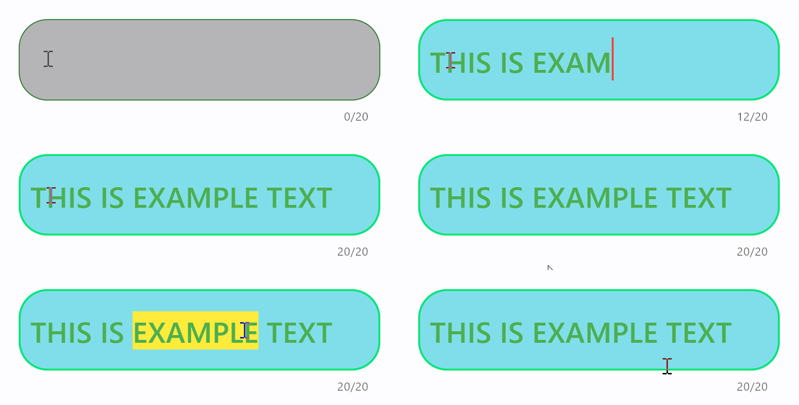
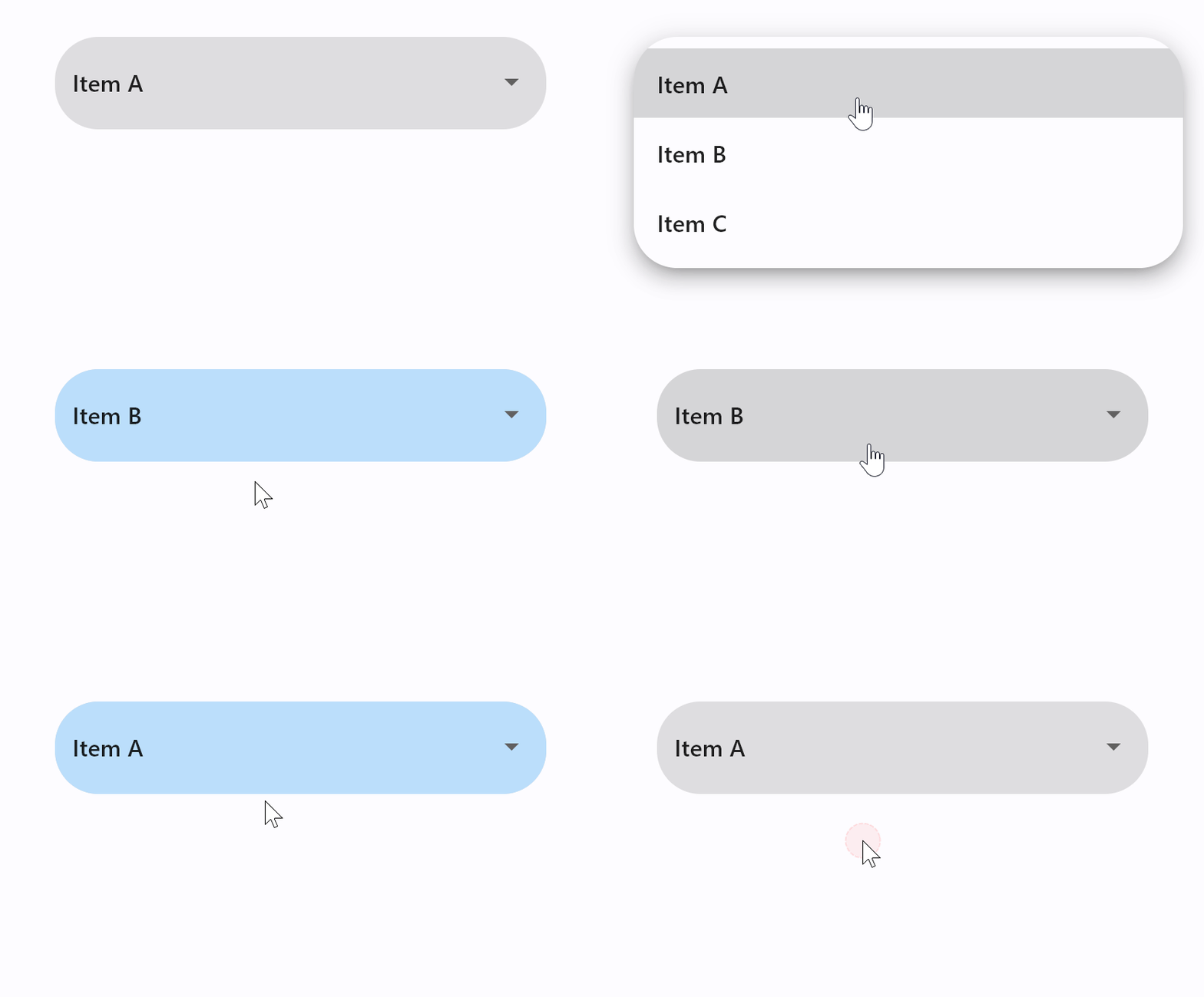
It is now possible to configure text size, border style and corners radius for normal and focused states of TextField and Dropdown controls. TextField also allows configuring colors for a cursor and selection.
Additionally, the maximum length of entered into TextField can now be limited with max_length property.
We also introduced capitalization property for automatic capitalization of characters as you type them into TextField. You can choose from 4 capitalization strategies: none (default), characters, words and sentences.
An example of styled TextField with max_length and capitalization:
import flet as ft

def main(page: ft.Page):
    page.padding = 50
    page.add(
        ft.TextField(
            text_size=30,
            cursor_color=ft.Colors.RED,
            selection_color=ft.Colors.YELLOW,
            color=ft.Colors.PINK,
            bgcolor=ft.Colors.BLACK26,
            filled=True,
            focused_color=ft.Colors.GREEN,
            focused_bgcolor=ft.Colors.CYAN_200,
            border_radius=30,
            border_color=ft.Colors.GREEN_800,
            focused_border_color=ft.Colors.GREEN_ACCENT_400,
            max_length=20,
            capitalization="characters",
        )
    )

ft.run(main)
An example of styled Dropdown control:
import flet as ft

def main(page: ft.Page):
    page.padding = 50
    page.add(
        ft.Dropdown(
            options=[
                ft.dropdown.Option("a", "Item A"),
                ft.dropdown.Option("b", "Item B"),
                ft.dropdown.Option("c", "Item C"),
            ],
            border_radius=30,
            filled=True,
            border_color=ft.Colors.TRANSPARENT,
            bgcolor=ft.Colors.BLACK12,
            focused_bgcolor=ft.Colors.BLUE_100,
        )
    )

ft.run(main)
Other changes
IconButton got selected state which plays nice with a new style.
This is an example of a toggle icon button:

import flet as ft

def main(page: ft.Page):

    def toggle_icon_button(e):
        e.control.selected = not e.control.selected
        e.control.update()

    page.add(
        ft.IconButton(
            icon=ft.Icons.BATTERY_1_BAR,
            selected_icon=ft.Icons.BATTERY_FULL,
            on_click=toggle_icon_button,
            selected=False,
            style=ft.ButtonStyle(color={"selected": ft.Colors.GREEN, "": ft.Colors.RED}),
        )
    )

ft.run(main)
Give Flet a try and let us know what you think!