OutlinedButton
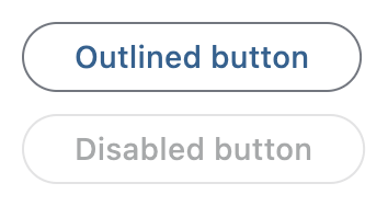
Outlined buttons are medium-emphasis buttons. They contain actions that are important, but aren't the primary action in an app. Outlined buttons pair well with filled buttons to indicate an alternative, secondary action.
Example:
ft.OutlinedButton(content="Outlined button")

Inherits: LayoutControl, AdaptiveControl, ActionControl
Properties
autofocus- True if the control will be selected as the initial focus.clip_behavior- The content will be clipped (or not) according to this option.content- A Control representing custom button content.icon- An icon to display in this button.icon_color- Icon color.style- The style to apply to the button.url- The URL to open when this button is clicked.
Events
on_blur- Called when this button has lost focus.on_click- Called when a user clicks this button.on_focus- Called when this button has received focus.on_hover- Called when a mouse pointer enters or exists this button's response area.on_long_press- Called when this button is long-pressed.
Methods
focus- Requests focus for this control.
Examples
OutlinedButton
import flet as ft


def main(page: ft.Page):
    page.title = "OutlinedButton Example"

    page.add(
        ft.SafeArea(
            content=ft.Column(
                controls=[
                    ft.OutlinedButton(content="Outlined button"),
                    ft.OutlinedButton(content="Disabled button", disabled=True),
                ]
            )
        )
    )


if __name__ == "__main__":
    ft.run(main)
Handling clicks
import flet as ft


def main(page: ft.Page):
    page.title = "OutlinedButton Example"
    page.theme_mode = ft.ThemeMode.LIGHT

    def handle_button_click(e: ft.Event[ft.OutlinedButton]):
        button.data += 1
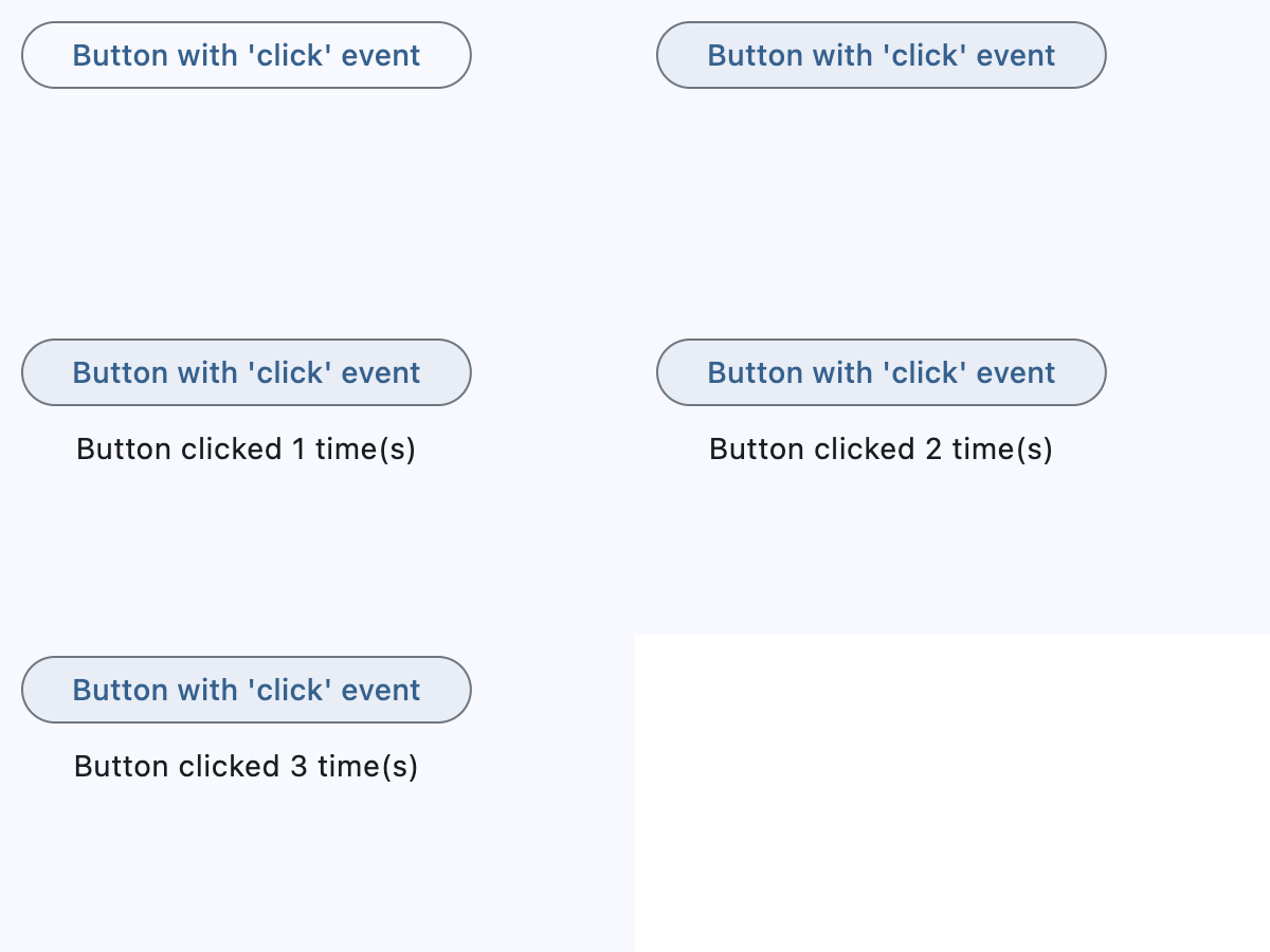
        message.value = f"Button clicked {button.data} time(s)"
        page.update()

    button = ft.OutlinedButton(
        content="Button with 'click' event",
        data=0,
        on_click=handle_button_click,
    )
    message = ft.Text()

    page.add(
        ft.SafeArea(
            content=ft.Column(
                controls=[button, message],
                alignment=ft.MainAxisAlignment.CENTER,
                horizontal_alignment=ft.CrossAxisAlignment.CENTER,
                expand=True,
            )
        )
    )


if __name__ == "__main__":
    ft.run(main)
Icons
import flet as ft


def main(page: ft.Page):
    page.title = "OutlinedButton Example"

    page.add(
        ft.SafeArea(
            content=ft.Column(
                controls=[
                    ft.OutlinedButton(
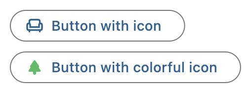
                        content="Button with icon", icon=ft.Icons.CHAIR_OUTLINED
                    ),
                    ft.OutlinedButton(
                        content="Button with colorful icon",
                        icon=ft.Icons.PARK_ROUNDED,
                        icon_color=ft.Colors.GREEN_400,
                    ),
                ]
            )
        )
    )


if __name__ == "__main__":
    ft.run(main)
Custom content
import flet as ft


def main(page: ft.Page):
    page.title = "OutlinedButton Example"
    page.theme_mode = ft.ThemeMode.LIGHT

    page.add(
        ft.SafeArea(
            content=ft.Column(
                controls=[
                    ft.OutlinedButton(
                        width=150,
                        content=ft.Row(
                            alignment=ft.MainAxisAlignment.SPACE_AROUND,
                            controls=[
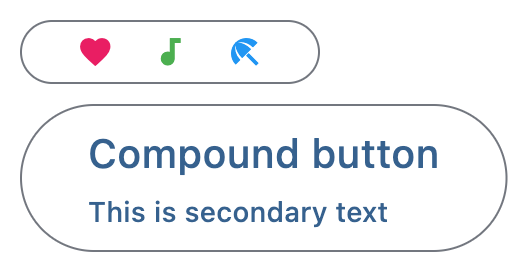
                                ft.Icon(ft.Icons.FAVORITE, color=ft.Colors.PINK),
                                ft.Icon(ft.Icons.AUDIOTRACK, color=ft.Colors.GREEN),
                                ft.Icon(ft.Icons.BEACH_ACCESS, color=ft.Colors.BLUE),
                            ],
                        ),
                    ),
                    ft.OutlinedButton(
                        content=ft.Container(
                            padding=ft.Padding.all(10),
                            content=ft.Column(
                                alignment=ft.MainAxisAlignment.CENTER,
                                spacing=5,
                                controls=[
                                    ft.Text(value="Compound button", size=20),
                                    ft.Text(value="This is secondary text"),
                                ],
                            ),
                        ),
                    ),
                ],
            )
        )
    )


if __name__ == "__main__":
    ft.run(main)
Properties
autofocusclass-attributeinstance-attribute
autofocus: bool = FalseTrue if the control will be selected as the initial focus.
If there is more than one control on a page with autofocus set, then the first one added to the page will get focus.
clip_behaviorclass-attributeinstance-attribute
clip_behavior: ClipBehavior = ClipBehavior.NONEThe content will be clipped (or not) according to this option.
contentclass-attributeinstance-attribute
content: StrOrControl | None = NoneA Control representing custom button content.
Raises:
- ValueError - If neither
iconnorcontentis provided.
iconclass-attributeinstance-attribute
icon: IconDataOrControl | None = NoneAn icon to display in this button.
styleclass-attributeinstance-attribute
style: ButtonStyle | None = NoneThe style to apply to the button.
Use this to override visual properties such as colors, padding, shape, and
outline side. For outlined buttons, specifying the outline appearance usually
requires setting both ButtonStyle.shape and
ButtonStyle.side.
Events
on_blurclass-attributeinstance-attribute
on_blur: ControlEventHandler[OutlinedButton] | None = NoneCalled when this button has lost focus.
on_clickclass-attributeinstance-attribute
on_click: ControlEventHandler[OutlinedButton] | None = NoneCalled when a user clicks this button.
on_focusclass-attributeinstance-attribute
on_focus: ControlEventHandler[OutlinedButton] | None = NoneCalled when this button has received focus.
on_hoverclass-attributeinstance-attribute
on_hover: ControlEventHandler[OutlinedButton] | None = NoneCalled when a mouse pointer enters or exists this button's response area.
data property of event object contains true (string) when cursor enters and
false when it exits.
on_long_pressclass-attributeinstance-attribute
on_long_press: (
    ControlEventHandler[OutlinedButton] | None
) = None
Called when this button is long-pressed.